
I have a free live online facilitator guide template, or lesson plan, that you can download and use for your webinar and virtual classroom planning and delivery.
In this blog post I am going to look through the history of my lesson plans over the years, to highlight the good practice and different options available to you. Let me know in the comments what you like and what it is that you do!
Not much time? Jump to:
- Detailed opening on the session plan
- Focus within a session
- Highlighting questions
- Portrait or landscape?
- Joy of tables
- Fresh air of slide images
- Consistent templates
Teacher training lesson plans
Way back in 2002 I was working as a lecturer in further and higher education, and had completed my Certificate in Education (or PGCE for many – I did my degree later, so it wasn’t “post-graduate” for me).
One of the many things we obviously covered was lesson planning. The below is an example of a lesson plan I used for the National Certificate in Computing to teach Internet Explorer – no comments about the content showing my age please! Click to see a larger image, or read below for the detail.
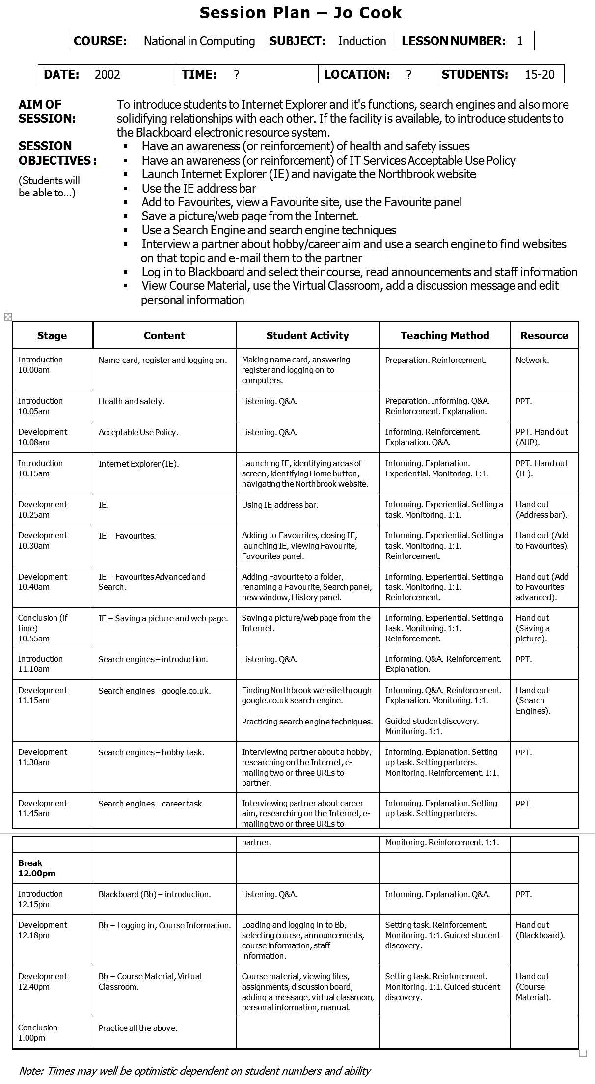
The importance of detail
I like the detail on this lesson plan, such as the course, subject, the number of students and so on. Also the aim of the session immediately tells you what you are doing, and the session objectives gives more specific detail.

Ah those session objectives… yes, the terrible “students will be able to” and variations of “have an awareness of” or “understand”. I don’t use those types of objectives now – how can you observe “understanding”? But I didn’t know better when I first started in teaching, and that’s what my teaching course taught us to do!
I’m glad that what I do have in here are some action-based objectives, that I can truly observe the students doing to know that they have learnt something – such as “navigate to the Northbrook website” or “save a picture from the internet”. Having these tangible actions as objectives is important as it means I would teach people how to do actual things – not just theory. Also it means that it was hands-on for them, and not about me lecturing to them, despite that being my actual job title!

Take-away points:
* Initial details help the trainer know what the session is about
* Action-based objectives mean you are teaching the how and not just the what
During the session
The main section of the session plan breaks down what is happening throughout:

The way I was taught to design session plans at the time, was to break the sessions into stages of:
- Introduction
- Development
- Conclusion
This was to help with the learning flow. Whilst I don’t document it this way now, it did train me into thinking about how to introduce a topic or concept, develop that into an activity and conclude it with a summary and a reminder of the key learning point.
This session plan separates the content, what the student is doing, the teaching method and the physical resources needed. I liked that last column, it’s always great to look through and check you have everything you need for a session, rather than realising half way through!
Separating the student activity from the teaching method is also a great concept as it really helped me to focus on ensuring that the student was an active participant. You’ll see that the activities include listening, Q&A and other specific actions relating to the topic/class. Too much of the “listening” option and I know I’m doing a lot of lecture!
Likewise with the teaching method, ensuring that there was “setting a task” as well as “1:1” for individual attention and so on were important.
All of this work was a really good grounding for how I would design and deliver my sessions further in my career.
Take-away points:
* Listing the resources gives you a quick check list to make sure you haven’t forgotten anything
* Separating content and attendee activities helps you focus on what people are doing in the session
Corporate learning plans
Quite a few years later, working in the corporate environment, I’d built on the above and developed the learning plans I worked with. Again, just click on the images for larger versions, or read through for the detail.

From the above example, there’s the time spent on a section of the session, the topic being covered and the main activity – including “group discussion”, “group activity” and so on. This way of working is still ensuring the focus is on people doing something and not being a passive member of an audience.
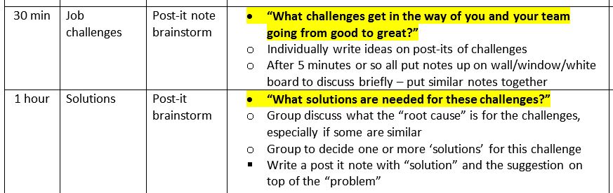
Highlighting the questions
Below, in a close-up, you can see I’m highlighting the key questions to ask in the session. As I’ve planned and written the session, I probably don’t need to read everything, such as the part that states “individually write ideas on post-its of challenges” as I know what’s coming up. The detail is there to remind me, or for another person to deliver.
The thing that needs to jump out is the question of “what challenges” there are. This is so that I can glance at the information and be reminded, without having to be standing at the front of the class and actually read my own notes. I feel this is more professional than having to read every detail of what I’m doing next.
Likewise below is a specific activity outline from a course back in my further/higher education days. I’ve highlighted the questions in, what is now, my trademark bright pink text. Yes, I’ve designed the activity and I should know how to run it, but its the specific question reminders that I need to jump out to me in the moment.
It’s also a good reminder on how to run the activity. I hadn’t seen this document in probably 15 years, but reading through this reminded me of exactly what we did and why, and I remember it being a really useful activity. Given the resources, I could deliver this again as I have the documentation to help me.
Take-away points:
* Putting questions in a vibrant colour helps you facilitate without reading detail
* Detailing the ‘script’ or activity helps you deliver infrequently and others understand your material
The landscape lesson plan
As with the some other examples, I had moved into landscape page layout. With columns of information it meant a better use of space.
In portrait mode if a column didn’t have much in it (for instance a short note about physical materials) then a lot of the page is wasted on needing a column for it. This then made the document even longer than it needed to be – and when you are printing them out and flicking through them during the day, that makes quite a difference.
With the session plan in landscape mode it meant that the page was shorter and less space was wasted.

This slightly different approach still included the resources (not shown above) but reduced the amount of other columns I normally included. Instead there are bullet points within the main facilitator column, including what is planned, such as showing a video, then the follow-up questions.
A different approach here was using an arrow symbol and “ask” in bold, with the question. It’s all in a soft yellow highlight too.

This still highlighted the question to make it easier to facilitate in the moment whilst scanning a document and looking for that graphical element.
Also in this example I included the kind of answers to expect from a group. This is because I had found myself delivering a version of this training and not really knowing what the answer to the question was! By doing this new trainers would have an idea of what the attendees might say.
Tables and rows and columns, oh my!
A key development across my session plans was the good use of tables. This was so that it was easy to read when training, but also easy to write the content so that it was legible later, let alone when I wanted to edit it. Something simple like the timing or the resources to use would all match up.
In the very first example, above, each row was a point in time or activity. This meant that the grid lines made it really easy to see the separation. Even in the example directly above this is still the case, a 15 minute section is what is shown.
I’ve continued this in my live online facilitator guide, as it means that each slide is in it’s own row and has it’s own timing associated with that. I’ve seen people use this and put several slides in one row together. I’m fully behind people adapting it to make it better for their needs, but when I’ve been coaching people who have showed this to me, it’s never actually made their life easier!
Take-away points:
* Design the page layout of your lesson plan to make the most of the page/screen as you use it
* Using tables/rows/columns separates content and makes it easy to populate content
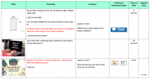
Slide thumbnails
My training hasn’t always been slide or PowerPoint heavy. And that’s right, it should be about the people and the activity, slides can help in some situations.
However as I moved into using PowerPoint more and more, especially with live online delivery, the emphasis on the slides was more important. In webinars and virtual classrooms this is partly because we don’t usually have webcams on all the time, so we need to keep visual focus of the learners. We also use the slides a lot for activities too.
By this point in my career I was freelancing and working as an associate for a variety of different training companies. The example below is mocked up with dummy text in it, but gives you a sense of how the facilitator guide looked for some sessions I was delivering.
From my point of view there wasn’t a lot of detail for specific activities and it was fairly out of date from what was actually delivered, so i had to make lots of notes when shadowing the trainer.

Also, the slides were numbered. Some of the sessions could have 50 or more slides. If we added a new slide 10, we had the manually renumber the following 40 slides. I did that more times than I care to admit, before finally putting screengrabs of the slide in.
It was like a breath of fresh air! Not only did it mean no more slide renumbering, actually delivering the session was so much easier. I could visually see what was coming up next, without having to read it. It meant I didn’t need my slides printed out separate from my notes too.
This was the big leap that helped me get to my current facilitator guide look and really help with the cognitive processing during my live online sessions.

Take-away points:
* Using slide thumbnails is a quick and simple way to refer to what is coming next
* Audit what is taking time when documenting your session plans and see what you can improve
Process, process, process!
Have you ever been in the situation of taking over training from someone who has left the organisation, or perhaps covering someone who is off sick? I have, and it’s usually not pleasant!

In one particular situation the session had no delivery notes at all – just slides. Some of the slides were relatively obvious to a decent trainer who knew the company and the topic, of which I felt I was one.
However some slides were packed full of text, some kind of scenarios. But without any notes, I didn’t know what the questions were to focus on for each scenario. And I didn’t know if they were quick five minute high level discussions, or 20-minute-plus deep conversations.
As the person was off on long-term sick leave, I ended up working last minute with the subject-matter expert (who had no idea either) and I had to re-design that section so I could confidently deliver something that met the objectives.
You’ve probably all had a version of this experience, which is why having documentation for your training delivery is so important, even if you are tailoring to groups on the day – you need a starting point and some consistency across trainers and teams.
Templates to the rescue
In one organisation I did just this – I was proud to put together a group of us to work on a template facilitator guide for our delivery. It included aspects of what I’ve mentioned above, as well as:
- The content to check before running the course
- The materials to use and where they were (some were digital on a shared drive, some on an intranet, some physical in specific locations)
- Materials checklist for each day of delivery – in some cases this also included the detail of what should be in a box, so that an activity could run properly
- The flip charts to prepare at the beginning of the day, including a photograph example of some of them
- What the L&D admin needed to do before the course, such as one week before, review attendee numbers, schedule welcome calls, print delegate packs, day after update the LMS etc.
- A one page overview of the day(s) timings and main topics, so that any facilitator could take a quick glance to understand the broader context
- And then the specific facilitator notes for delivery
In one such document, it was 17 pages in total, for two days of delivery, with the first 7 being the planning and preparation.
What this template meant was that we had a standard but flexible format that covered everything for the training sessions, and allowed people to be confident that they had everything that they needed to deliver a session or course. If there was sick leave or sessions that ran infrequently, the detail was there as a reminder.
Take-away points:
* A consistent, template approach to training sessions enables trainers to cover session
* A detailed guide means all members of a team know what to do and when for a particular course
Over to you
You’ve seen how I’ve moved from portrait, black and white lesson plans to my current live online facilitator guide, in landscape and with it’s use of colour, as well as the focus on the attendee and their performance needs.
What about you – what have you developed in your training documentation and how has it developed over the years? Comment below.
Loving this website so valuable during this new virtual world
Thanks Salim, glad it’s of use!
Do make sure to check out our free community too: https://lightbulbmoment.community/
Really love this. Thanks for sharing how your plans have evolves over time. Like you I added slide thumbnails to my session plans.
I’ve done this for other trainers but they prefer using the notes section on power point during their delivery to help guide their instruction.
What I’d love is to integrate the session plan in the notes section of Ppt. but the fact you can’t put a table in the notes section has meant this is only a pipe dream.
Unless someone out there has found a way round this!?
Thanks Dan, glad you found use of it. Understand about the notes section and a lot of people do prefer that, especially if that’s where it all is already. You could look at this template from Cindy Hugget: https://www.cindyhuggett.com/archive/sample-virtual-training-class%e2%80%a8-facilitator-producer-guide%e2%80%a8-template/
It’s quite different from my approach and helps with the notes section!