I’m attending a webinar right now, based in the States, from a large company that provides lots of webinars on different L&D and online learning topics. What I’ve attended so far has been good, and also different approaches to what I do, so I’m getting a lot from them.
I’m also reinforcing the things that I highlight to my COLF attendees about facilitating online sessions.
In the session I’m attending now, there was a reception slide deck (rolling repetitively at the beginning of the session). It was great at setting the scene of the topic, but it didn’t hold any technical information about how to get on to the audio conference or how to use the online classroom software. The host came on audio periodically to highlight green ticks and other emoticons. However they didn’t ensure that everyone could do this, nor did they explain how to get to the smiley faces – in WebEx this is a slightly different menu to the tick/cross and needs explanation to new users. Later in the session it was asked for without explanation.
Another of my annoyance’s with online learning is when the feedback icons aren’t cleared after they have been used. The icons stayed on the participants panel long after they were useful.
Whilst the content of the session was reasonably good, I was getting distracted by the slide design that could have bee vastly improved.
Some issues
For instance, a slide from a stock photo website that obviously hasn’t been paid for (it’s got the watermarks of the website on it) isn’t right in a professional context. Was this overlooked or the wrong slide deck loaded? Maybe, but either way, still not best practice:

Also the below slide of bricks was on screen for far too long! It was relevant for the first story that was being delivered and made the point nicely. Whilst the next story was linked to the first as part of a learning point, the visual didn’t match. Once I was aware that this had been on screen for too long I then timed it was on screen for another four minutes. This makes it visually boring when I can’t see a facilitator:

Unsurprising bullets
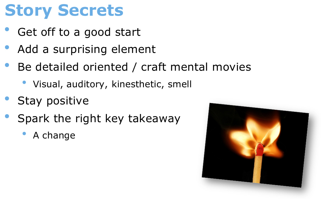
Another example is the below slide. Again the facilitator was talking through these points very well and making interesting content available to us. However it was all bullet points that weren’t needed. This one slide was on the screen for too long. The visuals didn’t match, such as “add a surprising element”, which was delivered by a boring bullet on what was building to be a full text-based slide. The slide after this one went on to highlight about cognitive overload and the importance of making things stimulating and interesting, which this hadn’t. Ironically a key message earlier in the session, was tweeted as “Don’t turn your participants’ brains into wilted lettuce. Presentations with bullet points can do this!” And then there were lots of bullet points!:
Key points reinforced to me:
- Important technical information and how to communicate is imperative at the beginning of any online session
- Visuals need to match the key points of your delivery
- Visuals need to change much more quickly in an online session to maintain interest
- One slide per message – therefore no bullets needed!
- Remind users how to log out of your particular software – don’t just shut down on them!